
The Psychology of Colours: How Different Hues Affect Mood
The power of colour extends beyond aesthetics, influencing various aspects of human life. In healthcare, colour is used to create soothing environments that promote healing. Hospitals often incorporate blues and greens into their design to reduce anxiety and provide a sense of calm. In education, certain colours have been found to enhance focus and memory retention, making them valuable tools in learning spaces. Yellow, for example, can stimulate mental activity, while green reduces eye strain and fosters concentration. Let's explore how different colours influence emotions, shape environments, and enhance various aspects of daily life.
The Influence of Colour on Human Emotion
Colour is an integral part of human perception, shaping the way people experience the world. The psychology of colour explores how different hues influence emotions, behaviours, and even physiological responses. From ancient times, colours have held symbolic meanings, guiding traditions, beliefs, and artistic expressions. Today, businesses, designers, and therapists harness the power of colour to create specific atmospheres and evoke particular feelings. Understanding the psychological impact of colours can provide deeper insight into how they shape daily experiences and moods.
The Warmth of Red: Energy, Passion, and Alertness
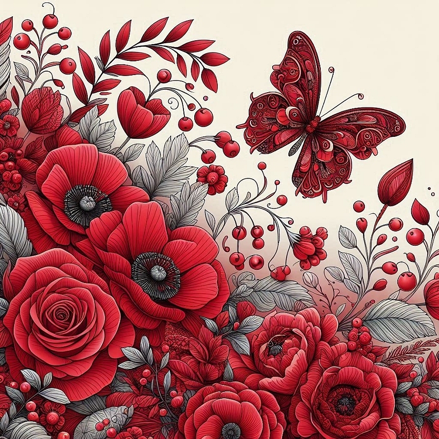
Red is a colour that commands attention. It is often associated with strong emotions such as passion, love, and excitement. Physiologically, red has been found to increase heart rates and stimulate adrenaline production, making it a colour of action and urgency. It is frequently used in warning signs and sale promotions due to its ability to create a sense of urgency. However, too much red can also evoke feelings of aggression or restlessness, which is why it is often used sparingly in environments that require calmness.
Beyond excitement and alertness, red is also linked to warmth and intimacy. It has a long-standing association with romance, symbolising deep emotions and desire. In spaces where social interaction is encouraged, such as restaurants, red can stimulate appetite and enhance engagement. When balanced with softer hues, it can create an inviting and vibrant atmosphere.
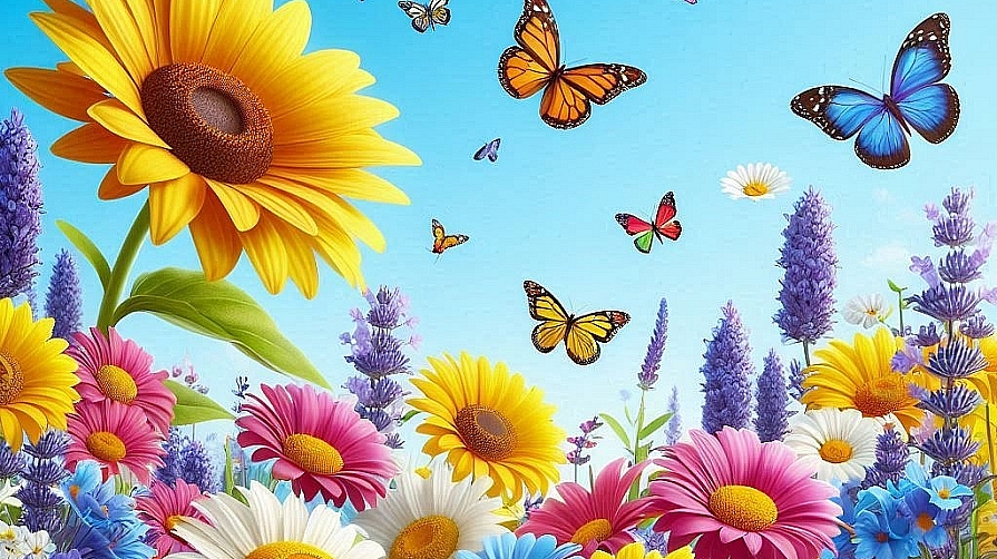
The Optimism of Yellow: Happiness and Mental Stimulation
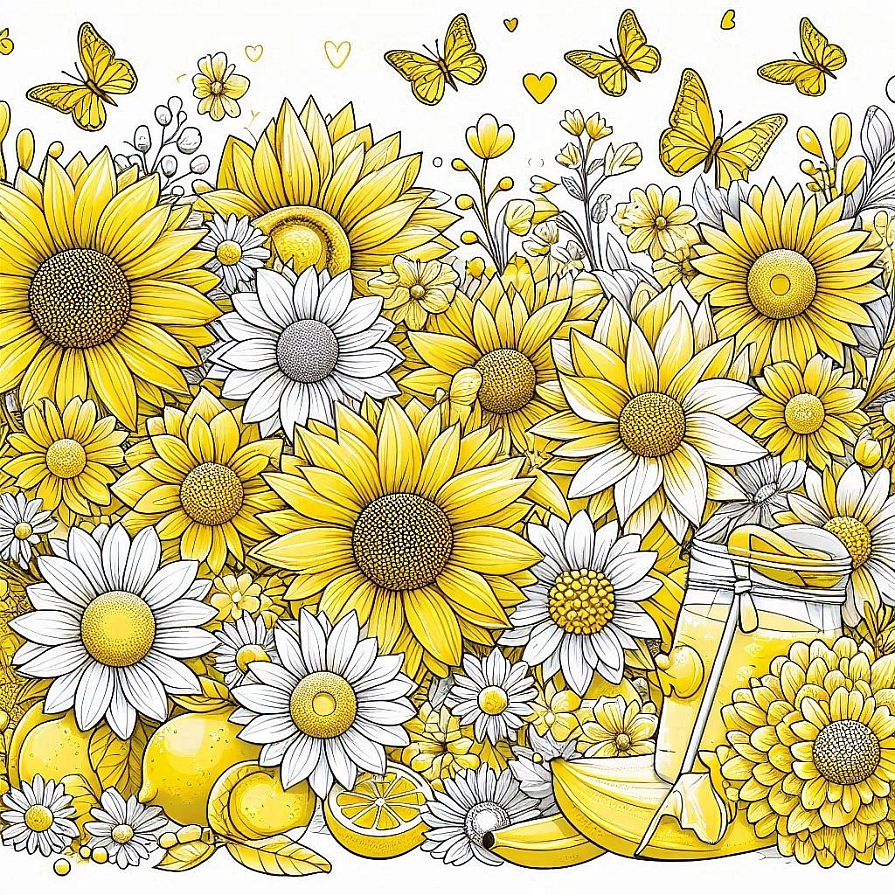
Yellow is often regarded as the colour of happiness, brightness, and creativity. It is reminiscent of sunshine, warmth, and positivity, making it a popular choice in spaces that aim to uplift and energise. Studies suggest that yellow can stimulate mental activity, making it useful in learning environments and workspaces where creativity is essential.
However, yellow can also have varying psychological effects depending on its intensity. While softer shades evoke a sense of warmth and relaxation, bright yellow can become overwhelming and even lead to feelings of irritation. Too much yellow in a space may create unease or restlessness, making it important to use it in moderation or pair it with soothing colours for balance.
The Serenity of Blue: Calmness, Trust, and Stability
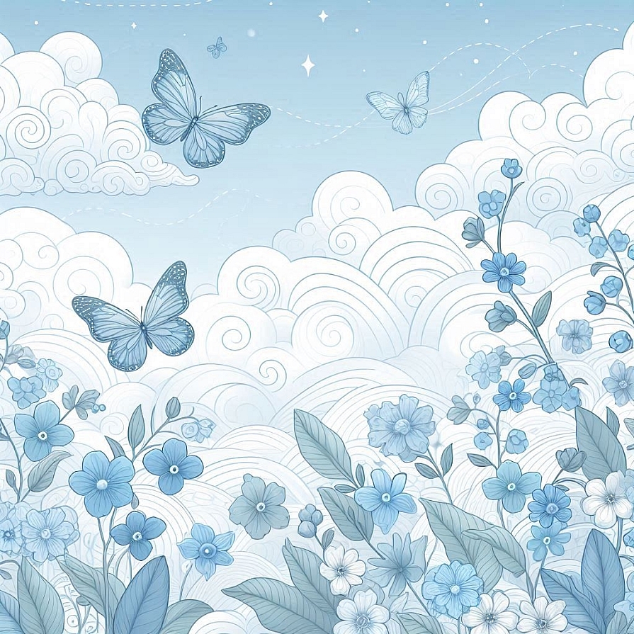
Blue is one of the most universally favoured colours due to its strong associations with tranquility and stability. It is often linked to the vastness of the sky and ocean, creating a sense of peace and expansiveness. Studies show that blue can lower blood pressure, reduce heart rate, and promote relaxation, making it an excellent choice for bedrooms, meditation spaces, and healthcare settings.
In addition to its calming properties, blue is also associated with trust and professionalism. Many corporate brands use blue in their logos and marketing to evoke reliability and confidence. However, darker shades of blue can sometimes create feelings of melancholy or detachment, which is why it is often paired with warmer colours to maintain a balanced atmosphere.
The Growth of Green: Balance, Nature, and Renewal
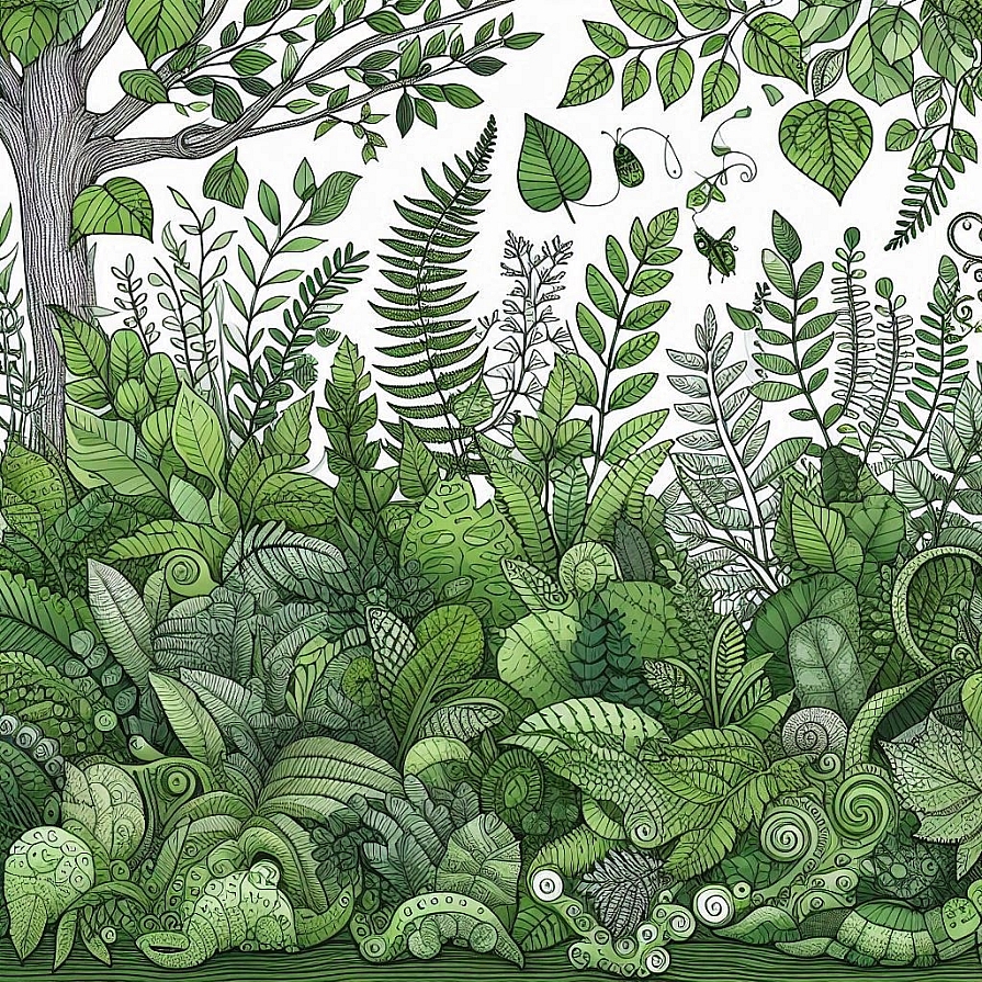
Green is the colour of nature, symbolising growth, renewal, and harmony. It has a soothing effect on the human mind and is often used to reduce stress and promote relaxation. Due to its strong connection to the natural world, green fosters a sense of stability and rejuvenation, making it a popular choice in interior design and therapeutic environments.
In workplaces and classrooms, green has been shown to enhance concentration and reduce eye strain, making it a practical choice for spaces requiring prolonged focus. Different shades of green can evoke different feelings, with deep forest greens creating a sense of sophistication, while lighter greens promote freshness and openness. The presence of green in daily life, whether through decor, plants, or outdoor scenery, contributes to a sense of well-being and emotional balance.
The Elegance of Purple: Creativity, Luxury, and Spirituality
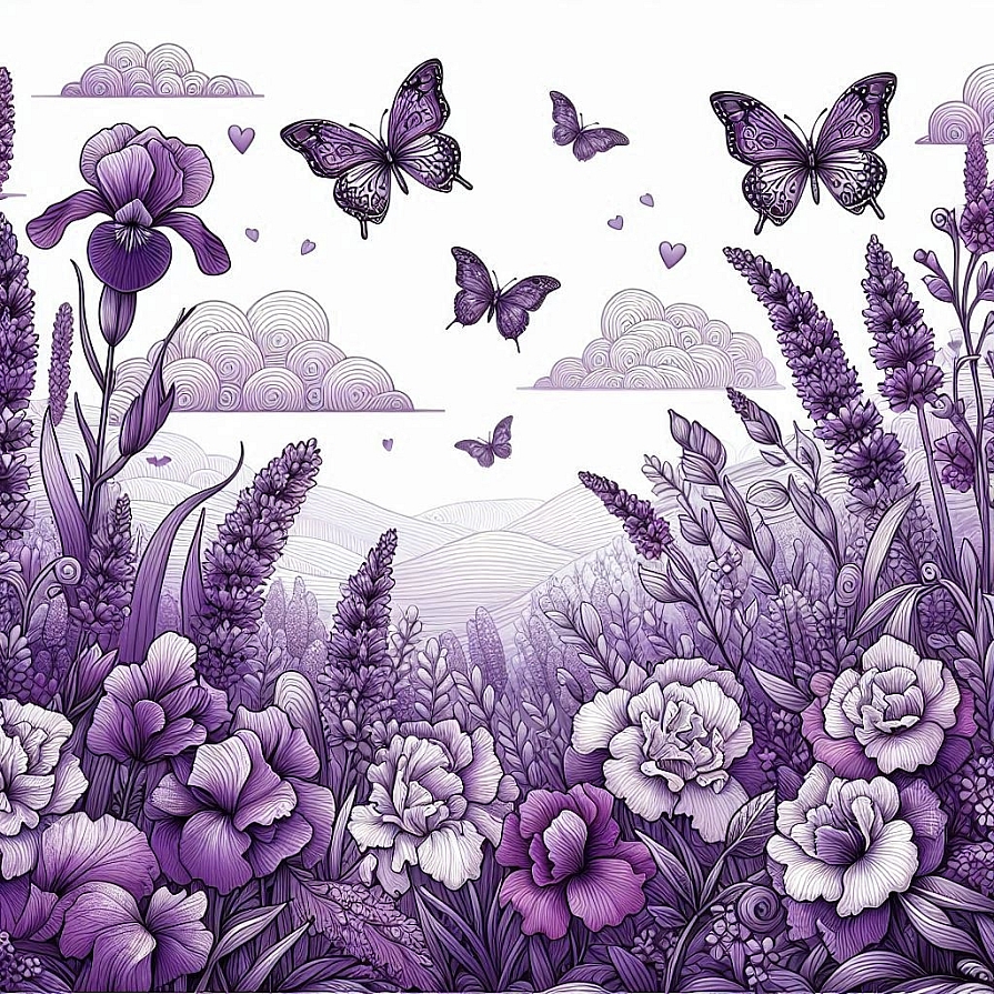
Purple is often associated with creativity, luxury, and spirituality. Historically, it was a colour reserved for royalty due to the rarity and expense of purple dye. This association with prestige and exclusivity continues today, as deep purples are often used to signify sophistication and opulence.
On a psychological level, purple stimulates creativity and introspection. It is frequently used in artistic and spiritual spaces to encourage deep thinking and emotional connection. Lighter shades of purple, such as lavender, evoke calmness and femininity, making them suitable for bedrooms and relaxation spaces. While purple is a powerful and versatile colour, its effectiveness depends on the context in which it is used, as too much can sometimes feel overwhelming or artificial.
The Comfort of Orange: Enthusiasm, Warmth, and Social Energy
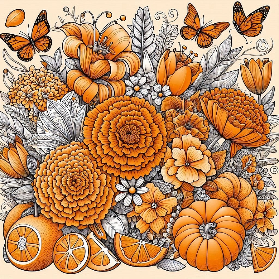
Orange is a dynamic and energetic colour that combines the warmth of red with the cheerfulness of yellow. It is often linked to enthusiasm, friendliness, and social engagement. This makes orange a great choice for spaces where interaction and creativity are encouraged, such as cafes, fitness studios, and communal areas.
The psychological impact of orange extends to its ability to stimulate appetite, making it a popular choice in food branding and restaurant design. It also creates a sense of warmth and comfort, making people feel welcomed and invigorated. However, like red and yellow, excessive use of bright orange can become overwhelming, so it is best paired with neutral tones to maintain balance.
The Mystery of Black: Sophistication, Authority, and Depth
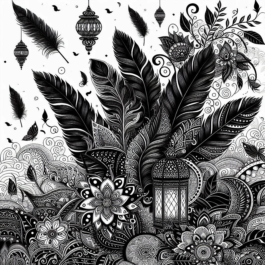
Black is often associated with power, sophistication, and mystery. It carries a sense of authority and elegance, making it a staple in fashion, branding, and interior design. While black can be used to create a bold and dramatic effect, it can also evoke feelings of seriousness or even sadness when overused.
In design, black is frequently paired with other colours to create contrast and depth. It enhances the vibrancy of surrounding hues, making them appear more striking. When used thoughtfully, black adds a timeless and refined quality to any space or aesthetic.
The Purity of White: Simplicity, Cleanliness, and Freshness
White is often associated with purity, simplicity, and cleanliness. It creates a sense of openness and light, making spaces feel larger and more airy. In healthcare and minimalist design, white is used to convey sterility and calmness, promoting a sense of clarity and renewal.
However, too much white can sometimes feel stark or impersonal. When balanced with warm tones or textures, it creates a welcoming and serene environment. White also serves as a neutral base that allows other colours to stand out, making it a versatile choice in various settings.
The Tranquility of Grey: Neutrality, Balance, and Modernity
Grey is a neutral colour that conveys balance and sophistication. It is often used in modern design to create a sense of subtle elegance and practicality. Unlike black, which is bold and commanding, grey offers a softer, more understated presence that blends well with other colours.
Psychologically, grey can evoke feelings of calmness and detachment. While it is useful in creating a sophisticated and professional atmosphere, excessive use of grey can sometimes lead to feelings of monotony or dullness. It is most effective when combined with vibrant colours to add warmth and dimension.
The Power of Colour in Everyday Life
Colour psychology plays a crucial role in shaping moods, influencing decisions, and enhancing environments. Each hue carries distinct emotional and psychological effects, making it an essential consideration in design, branding, and personal expression. While individual preferences and cultural associations influence colour perception, understanding the general effects of different colours can provide valuable insights into how they affect emotions and behaviours. By thoughtfully integrating colour into various aspects of life, it is possible to create harmonious, inspiring, and emotionally enriching experiences.
LEAVE A COMMENT


0.0451